Project Summary
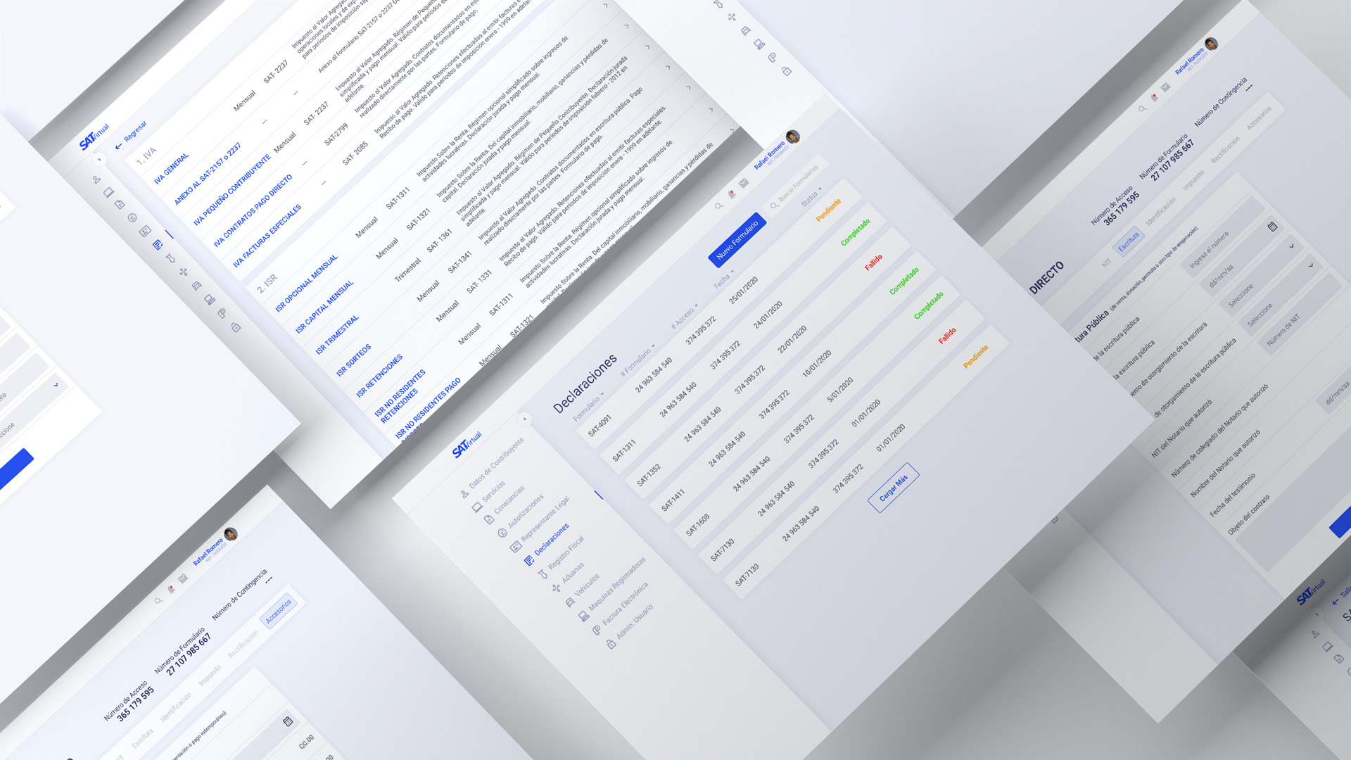
The tax paying portal of the government entity called SAT is out dated so I decided to take a one week challenge to give it a UI redesign and give it a more modern look and feel.
Project Type
UI Redesign Challenge
Timeline
2020 - 1 Week
Tools
Figma
My role
Primary areas of responsibility:
-UI Design
-Hi-Fi Prototyping (complete app flow)
The Challenge
The site has small font size that is difficult to read, cluttered information and it doesn't have affordances for the user to know hot to use the site.
Solution:
I did a site analysis and studied how the information was structured and how the user fills a form from start to finish. Then mapped out a flow with screenshots.
After the analysis, I wanted the site to have the following features:
1. Dashboard
2. Sidebar navigation
3. internal forms navigation
4. Status of forms
5. Clear information
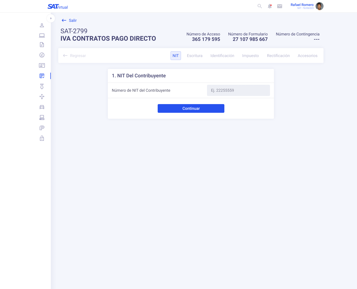
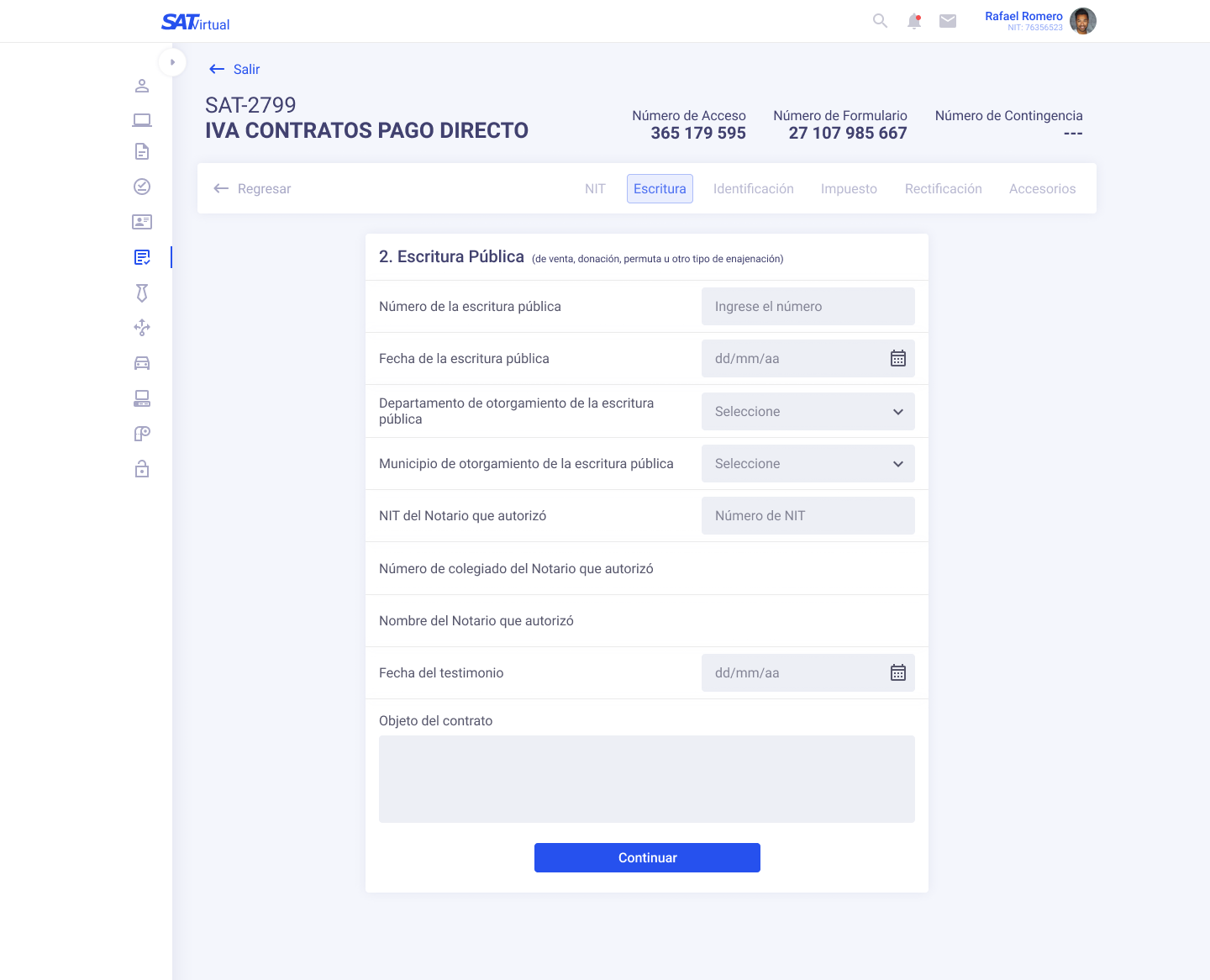
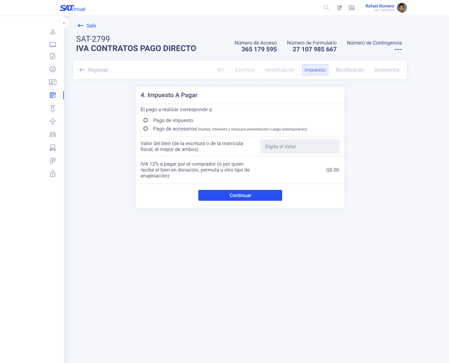
From there I decided a minimalist UI approach with a cold grey palette to give it a more formal look, I used cards to group information and tabs to make a clear navigation inside the form.

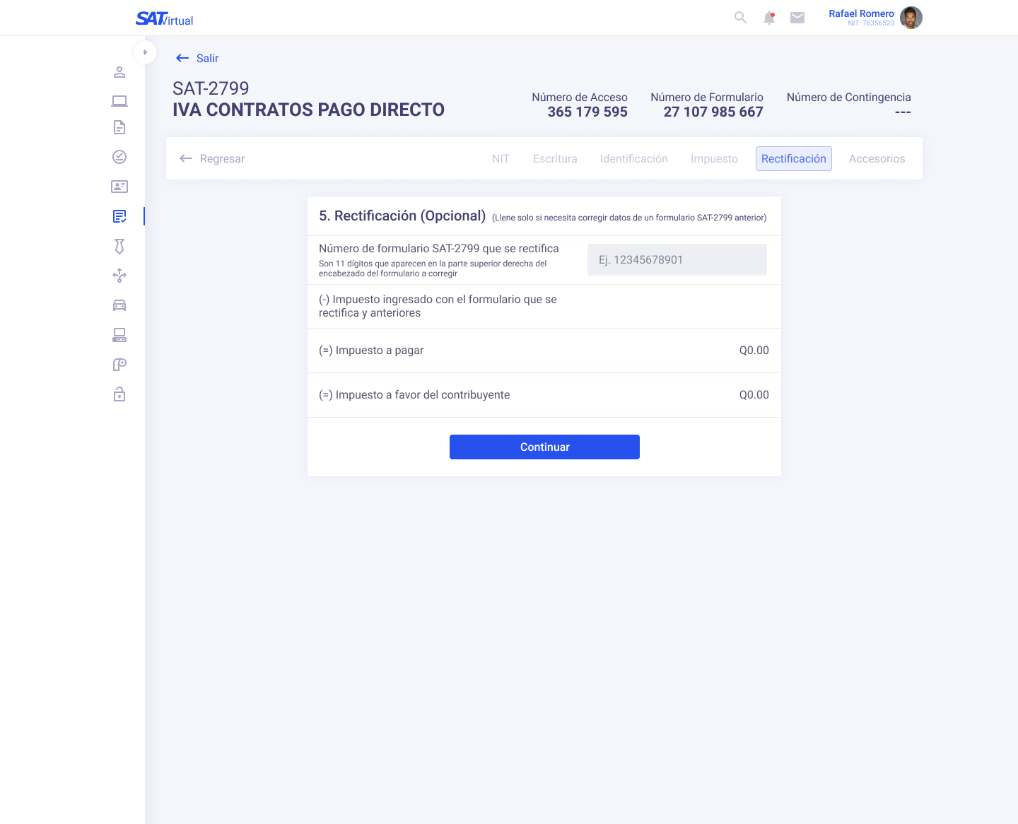
Live Prototype

